The first experience users have with Highland Ag MarketWatch creates a sense of confusion and frustration with very common flows.
The solution
Design a more automated approach to the account creation and login process.
The process
Stakeholder Meetings
Secondary Research
Site Map
User Flows
Swimlane Diagrams
Wireframe Flows
Prototyping
The results
Not only are users able to create and manage their accounts, project managers are not wasting valuable time with processes that are now automated.
Understand
A revolutionary product needs simple flows
During my time at Highland Ag Solutions, I became lead UX designer for one of their newer products: MarketWatch. This product was revolutionizing the agriculture tech industry, but was in need of some serious UX love and attention. Lots of user flow were not well thought through potentially creating a sense of illegitimacy. Not to mention, common flows that were used were confusing and lacked IA.
Project Complexities + Restraints
Had to follow a design and strict grid system
Didn’t have enough time to do thorough research with users (although that was in the works)
The agriculture industry is very competitive, thus no competitor information was available to create a competitive analysis like I wanted to
A few research methodologies
Secondary Research
I analyzed common user flows of big players in the tech industry where I identified patterns and UI elements to ensure easy learnability for users.
Stakeholder Meetings
I conducted many meeting with various stakeholders like customer support specialists, project managers, devs, and the UX team
Setting project expectations
I gathered my findings and set up a meeting with the stakeholders to discuss potential avenues from my research. We decided our goal was to update existing flows and create new ones that would allow users to easily create and manage their MarketWatch account.
Explore
Images may have quality issues due to losing access to Axure
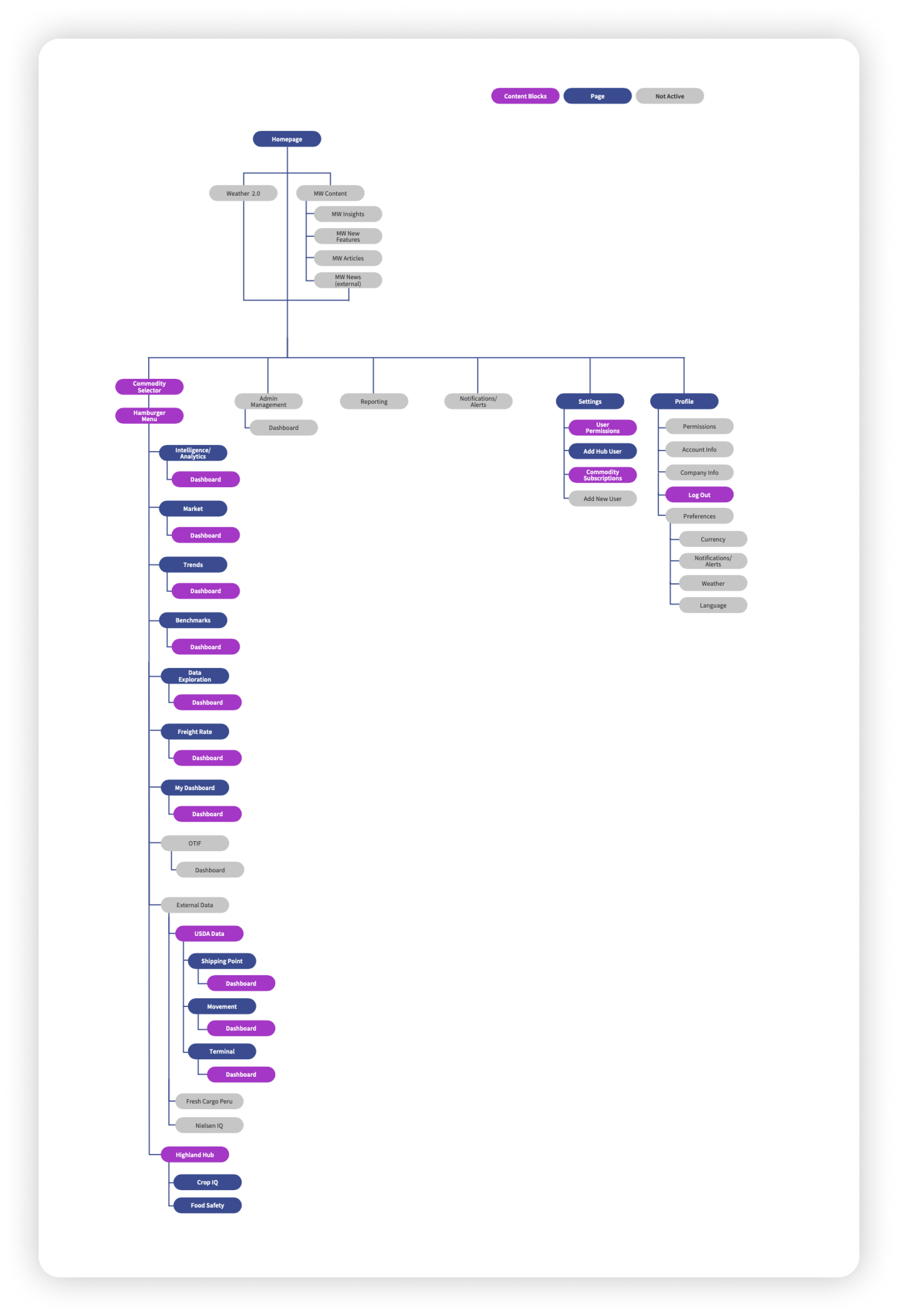
Time for a little structure
I met with stakeholders to discuss the site architecture where I created a sitemap that showed pages already created, content blocks, and wires in the work/potential future pages. This gave our entire team a good baseline of what the current MarketWatch page looked like and what our future was.
Images may have quality issues due to losing access to Axure
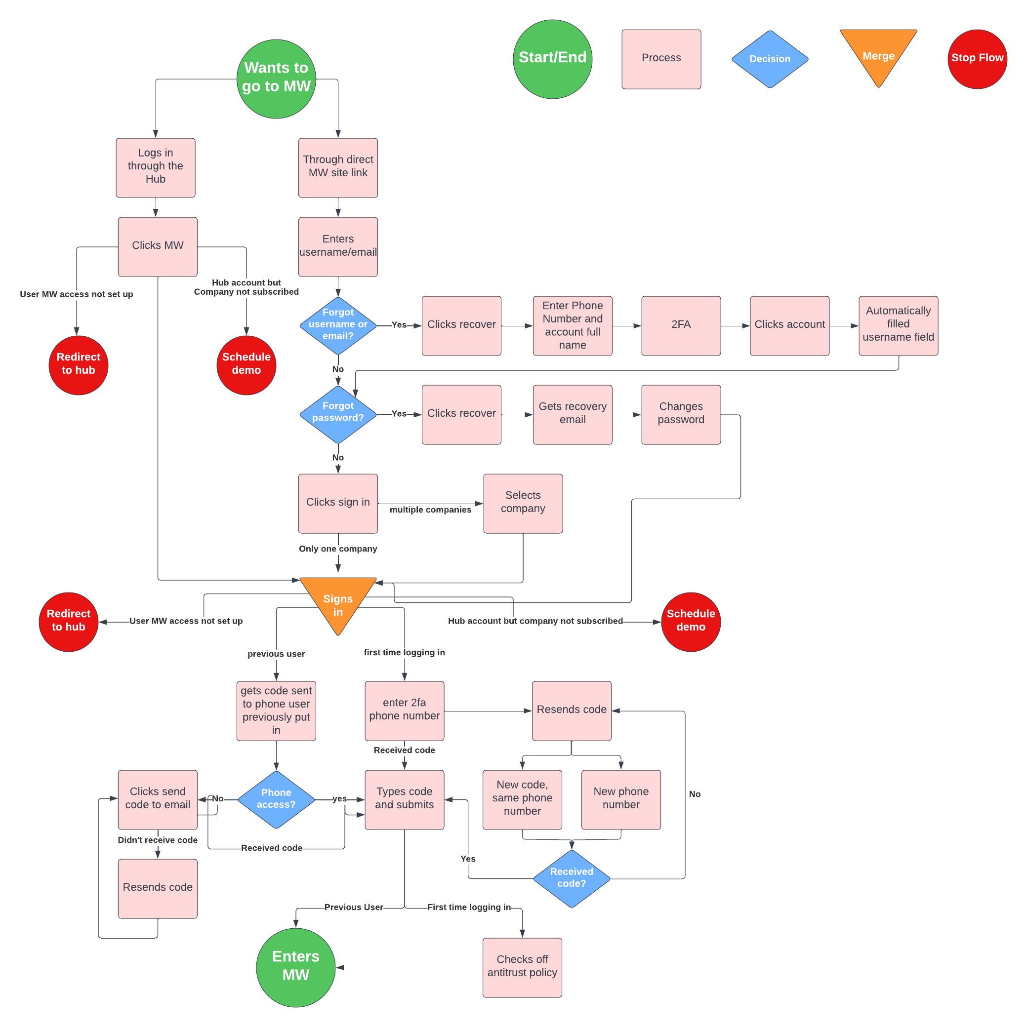
Did I mention complexity?
Not only was there a lot to think through when it came to a basic flow with forgetting password/username, two-factor authentication, non-users trying to log in, etc., but there were a few other aspects that added to the intricacy:
Users had two ways of accessing the login page. One way the user was already signed in through its parent website (Highland Hub) and the other they were coming from a direct link not signed in.
Every time a user signed in they would have to check the antitrust policy check box. I discussed with the legal team and figured out we only needed to have users check it once but give a way to access the document while they were in MarketWatch
If it was a user’s first time logging in, they would need to enter their phone number for 2FA and check the antitrust policy checkbox
A way for tech admins to access different companies
Clarity for the win
When creating the login wires, I had a rough baseline of what currently existed. Taking the user flow, I created new and edited old wires for a simplified, clear login flow. I was also able to update the design for a more modern, fresh approach.
Often I found a lot of mistake were made when project manager’s tried to explain confusing flows to the development team. To mitigate this risk, I created a wire flow from the completed wires to make things easier for devs and PMs. This also ensured everyone was one the same page by understanding the big picture.
Images may have quality issues due to losing access to Axure
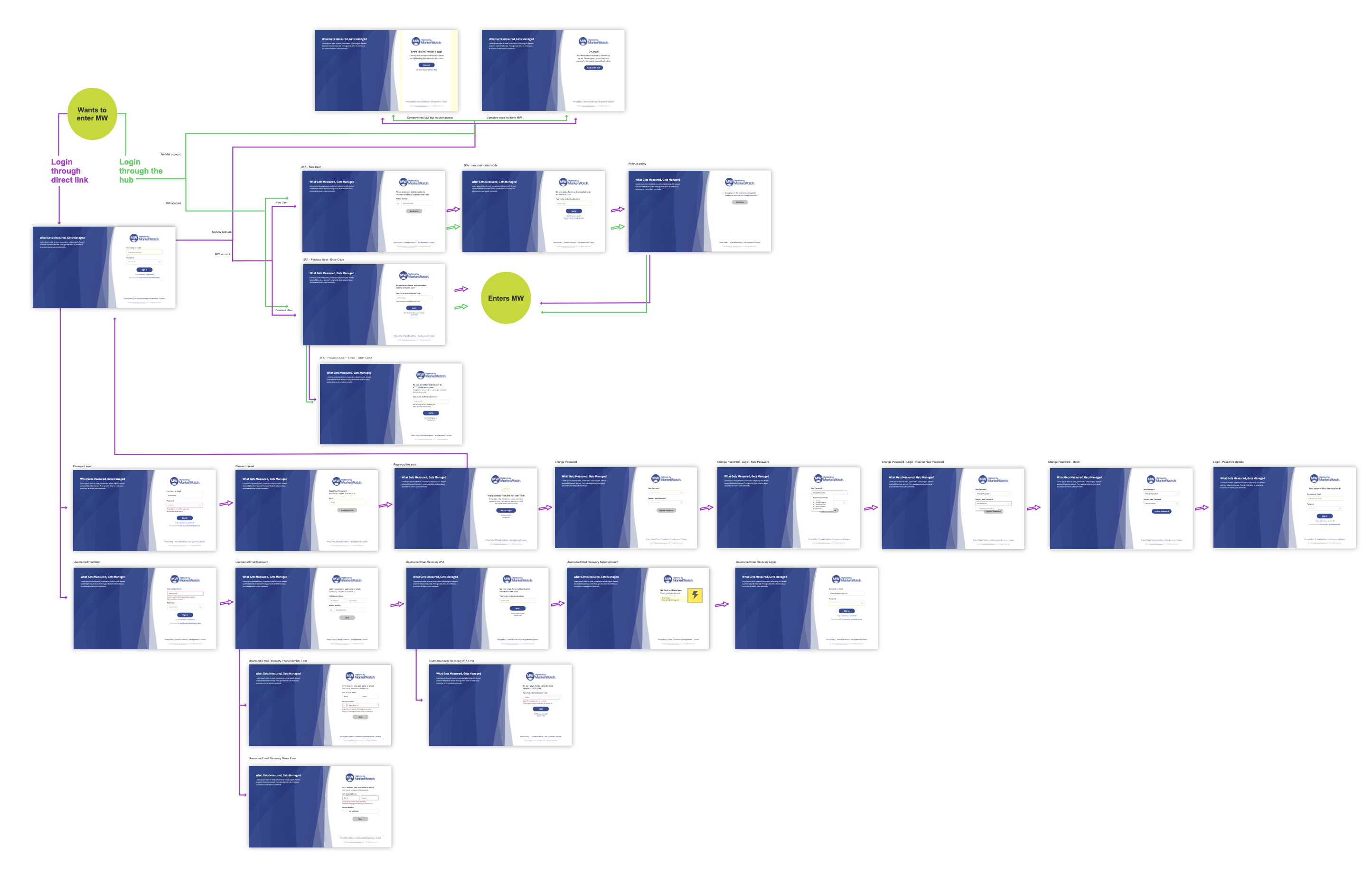
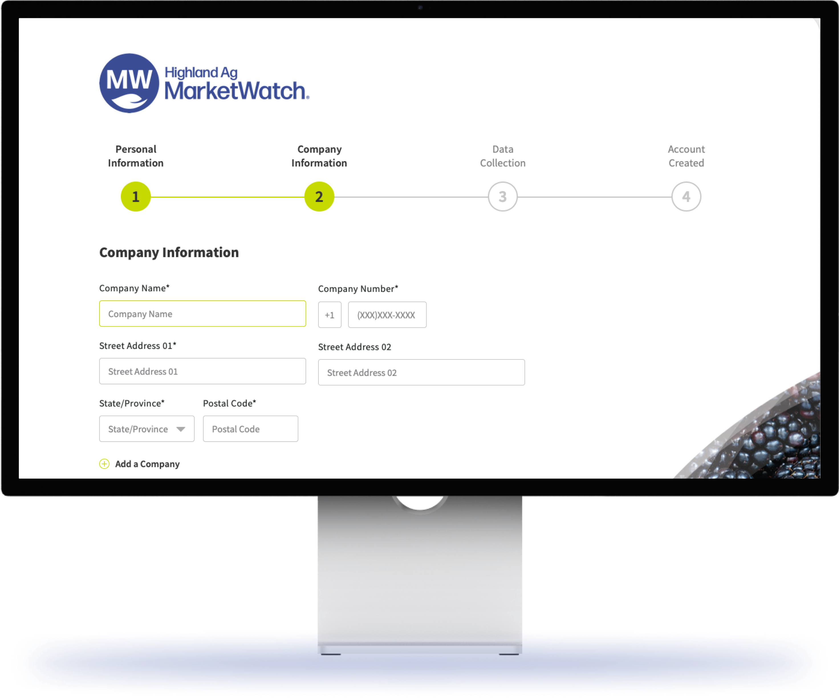
When I came on the team, MarketWatch did not have an automated way for users to create an account. This was due to many factors but primarily because there were specific details the Project Manager needed to get their account up and running. Not only does this waste time for the PM, but it also cumbersome for the user as well as creates a sense of unprofessionalism.
Why recreate the wheel when the Highland Hub already had a – although rough – account creation flow. I spoke with different stakeholders (customer specialists, UX team, PMs, and devs) to understand how the current flow worked. Then I made adjustments for what wasn’t working or simply unnecessary and added fields to acquire the desired information.
Images may have quality issues due to losing access to Axure
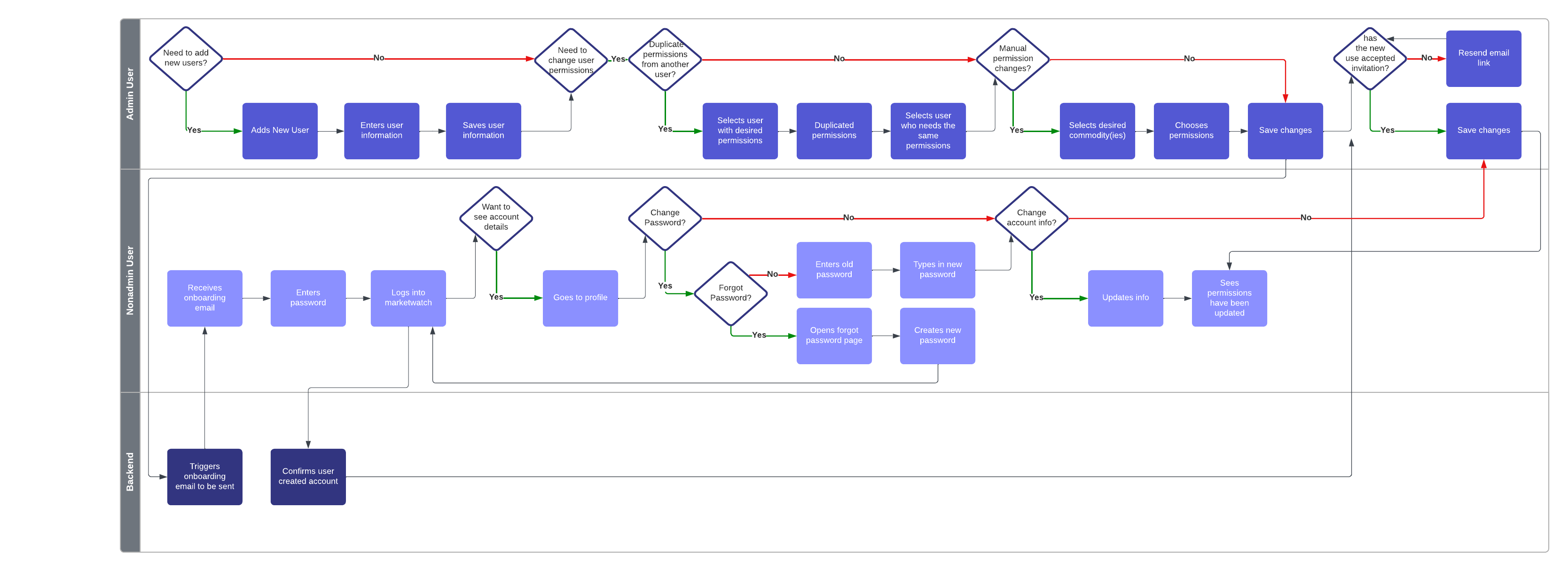
Interactions and... swimming?
Next, I needed to understand the interaction between admins adding new users and setting up their commodity permissions and a non-admin user creating their account. To better decipher this relationship dynamic, I created a swimlane diagram.
This was only the beginning
This was one of many projects I was a part of before I was laid off from my position at Highland Ag. If I were still there, here’s what I would’ve like to do:
Gather valuable user feedback
Begin my research plan on what users value most about MarketWatch and how we could improve or expand upon it
Conduct usability testing with clients on finished wires
Finish integrating the user permissions, subscriptions, account setting, and homepage
Thank you for coming along this journey with me
While you’re here, feel free to look at some of the other cool projects I’ve been a part of!