Users with dietary concerns feel it’s unsafe and more difficult to order food online.
The solution
Design a responsive site that is catered to modifying based on dietary concerns.
The process
Client touchbase
Secondary research
Competitive analysis
Focus groups
Sitemap and task flow
Prototyping
Usability test with A/B testing
The results
Cacao Tree’s new site creates a user experience focused on users safely ordering food for their dietary concern or preferences allowing them to feel more confident when ordering from Cacao Tree Cafe.
Understand
A niche market needs a niche site
In 2010, Cacao Tree opened up its location in downtown Royal Oak, Michigan. Since then, online ordering has grown to be around 60% of Cacao Tree’s total sales, which has made them want to optimize their branding and online ordering experience.
Throughout their 12 years of being open, they have built a very loyal customer base of food-conscious individuals by providing high quality food, local ingredients, and menu transparency. Whether their customers are nondairy, vegetarian, vegan, have food intolerances or severe food allergies, each customer has very important, yet different goal when it comes to what food they eat or, potentially, how they order it. I wanted to help Cacao Tree improve their online ordering experience by optimizing their responsive site for their main customer base.
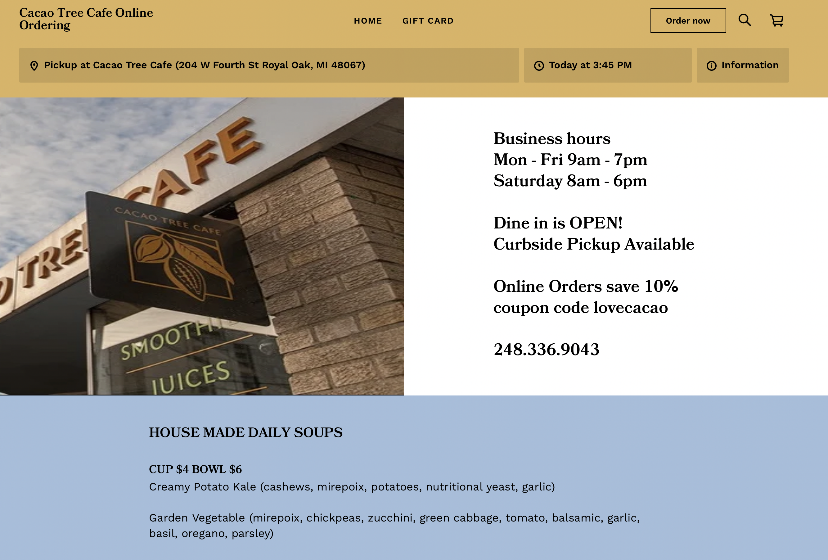
Cacao Tree Cafes Old Website
Okay, but what's the goal here?
The overall goal of my case study was to create a responsive site that’s optimized for Cacao Tree’s main customer personas: food intolerances/allergies, vegetarian, and vegan/nondairy.
Methods I took to reach my goal
Survey
An initial survey was sent out to interested participants to see if they met the requirements of the target market before being scheduled for the focus groups.
Secondary + competitive research
I looked at similar cafes/competitors and what they do when it comes to the UX/UI of ordering products or food online for health-consciences individuals.
Focus groups
Three focus groups with 3 participants of each food category were conducted to gain a deeper understanding of our research objectives.
Overall findings
Users want to find and purchase a dish that they know meets their consumptions needs and wants
Fulfills their safety and hunger hierarchy of needs
Users feel that comment boxes are not always followed
Users feel like restaurants or cafes that are more transparent about their menu care more about their dietary needs/wants
Users don’t trust restaurants and need to be assured that the restaurant cares
If they don’t have those things on the website, I shouldn’t bother because they won’t take my needs seriously.
– focus group participant
Overall findings
By taking the findings, I created a matrix to identify any patterns seen across the respondents answers. From the patterns, I was able to put together two personas: One Dish Oscar and Plant-Based Penelope
Explore
Time for some structure
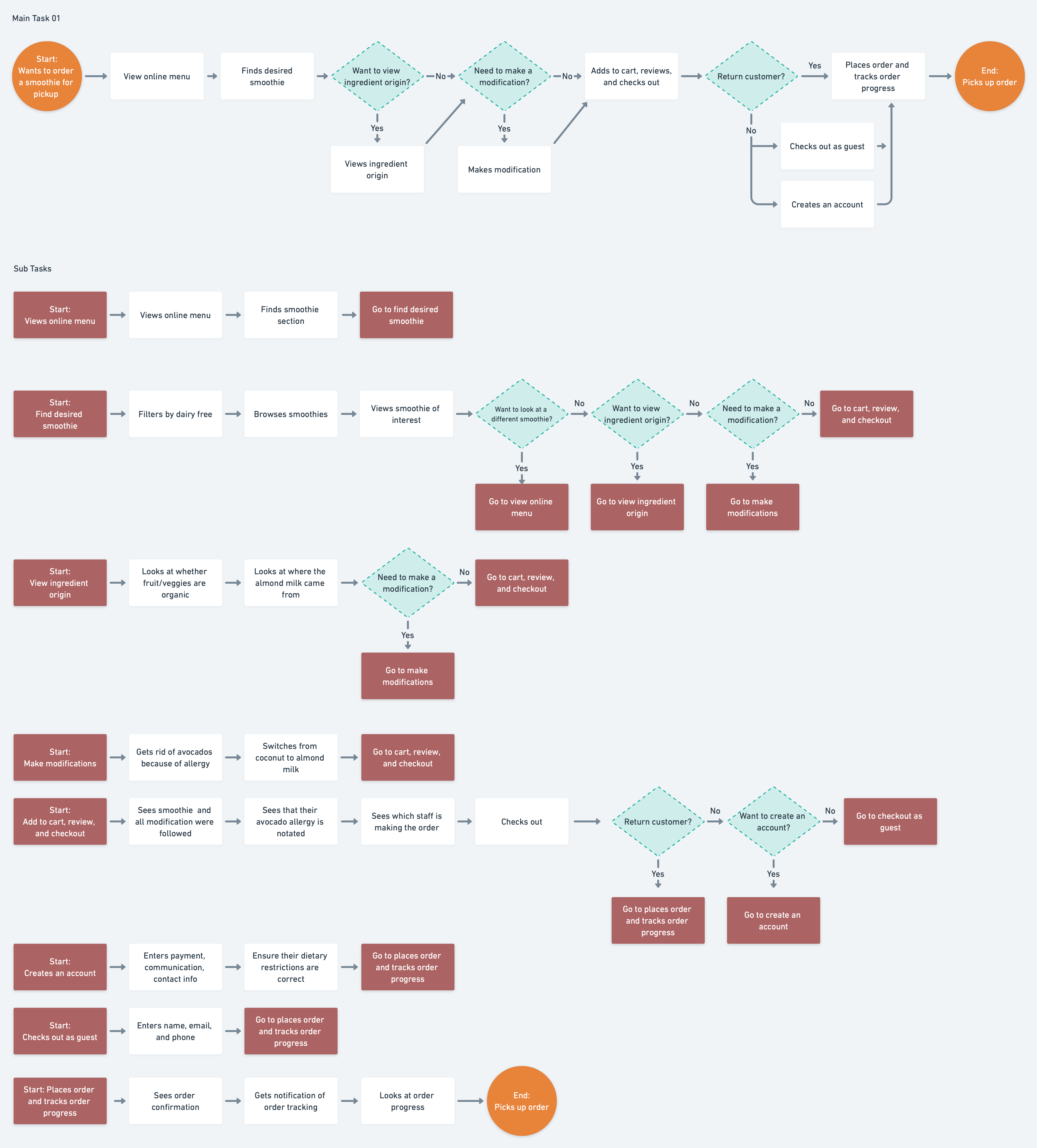
Cacao Tree’s current site did not have a well-structured or clear information hierarchy. I wanted to make sure when ideating my wireframes that I had a clear map of the hierarchy of the website.
What's the main task?
Now that I had the entire information hierarchy planned out, I planned out what the main task flow was for the user.
I found that Cacao Tree had one main task – completing an order – and 8 subtasks they want users to accomplish when entering their website.
I like when they have checkboxes to customize the order because they often miss what I say in the comment box.
– focus group participant
Sketch and implement
After sketching low-fidelity wireframes of multiple ideations of each page, I decided on which to develop into mid-fidelity wireframes.
One I completed all of the mid-fidelity wireframes for the smaller screen (mobile), I went through the same process for desktop. All the while taking similar UI elements and implementing them in a desktop format
I like that the concerns were already listed based on top food allergies. I felt that the business was anticipating my needs and accommodating me and making it easier to order
– usability test participant
Revamping the brand
Since Cacao Tree hadn’t updated their branding since their opening, they really wanted a revamped look and feel.
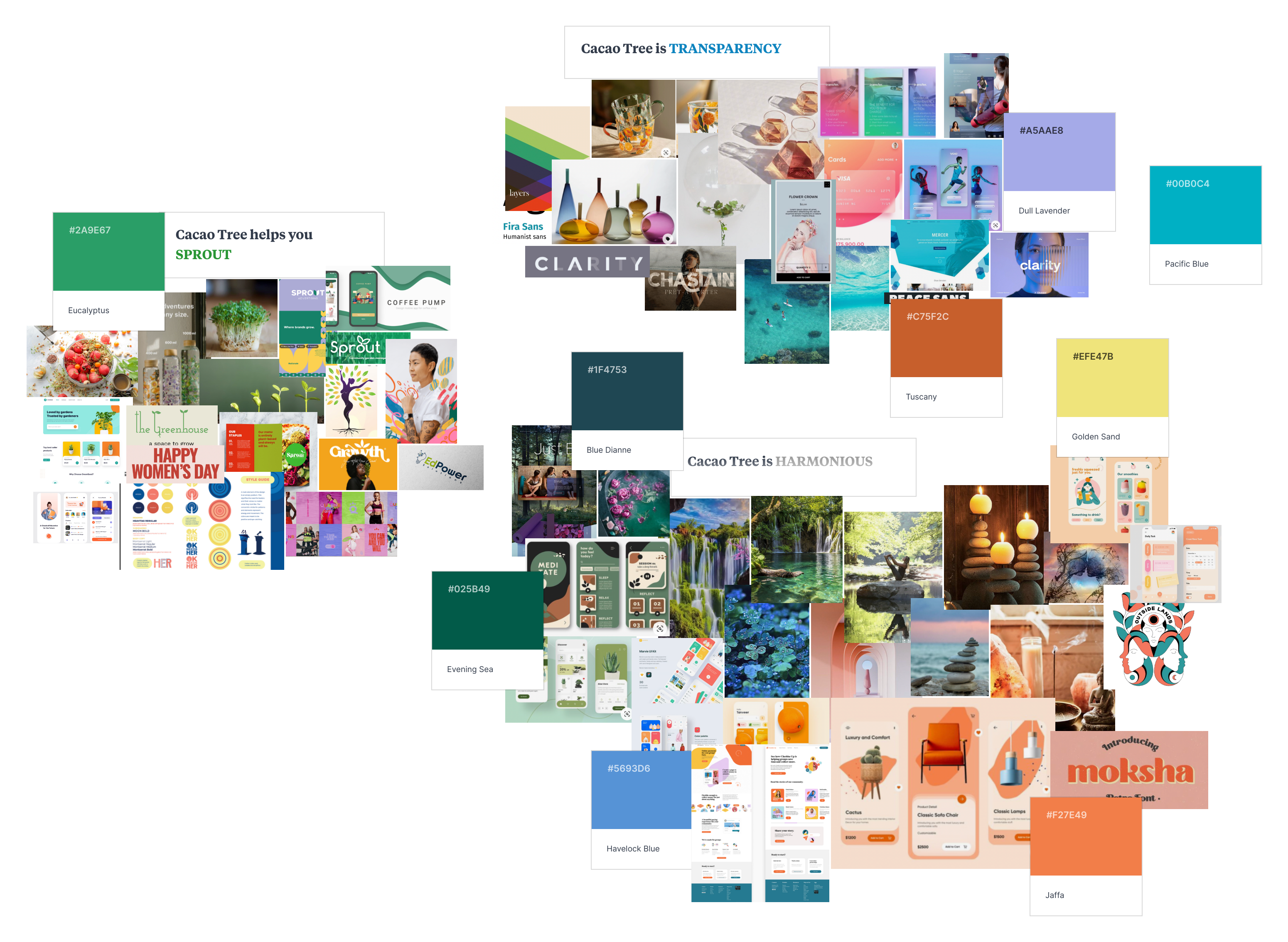
From the client, I was given a few keywords they felt described them as well as how they wanted to be percieved by their customers. I took these trigger words and expanded on them to:
sprout
harmonious
transparency
From there, I pulled imagery, UI, art, fonts, products, etc. to gather inspiration for each word.
A fresh take on a cafe
Logo
The three circle lines was inspired by the spiritual symbol of harmony with a tree being grown and the center of it all.
Typeface
Cacao Tree’s typeface is primarily the sans serif Outfit with organic touches of Mostra Muova to show a little more variety and uniqueness which really depicts the brand’s friendliness and inclusion.
Color palette
Initially, I had more color variety in the color scheme; however, the client felt like it didn’t represent them as well, so I toned back the color scheme to variations of earth and fresh tones to really showcase their connection to nature.
Icons
Did I mention I love iconography? All the icons were created by yours truly. Outline while inactive and filled when active/pressed, these icons have a minimalistic yet organic look which complements the branding nicely.
Other places need to take note of how beautifully organized and thought-out this was! It would make people with allergies feel a little more at ease when ordering or finding a new place to eat.
– usability test participant
Cacao Tree comes to life
This is where you can really see Cacao Tree Cafe come together. The combination of colors in the background mixed with the iconography and fonts started to feel like a distinct brand. My clients absolutely loved how the branding came together but, more importantly, how much the user experience would improve for their customers.
More importantly, I discovered, in order to best tailor the UX to users with dietary concerns, I would want them to create an account where they could insert their dietary concerns/preferences.
Materialize
Let's get to testing
Building the prototype
With my high-fidelity wireframes made, I created an interactive prototype in Figma to show and test how the user experience might feel.
Testing the prototype
Do users feel like creating an account is beneficial as it’s an extra step in the user experience process?
Do users know that Cacao Tree takes extra precautions to ensure their dietary concerns are taken care of?
Does the branding make users feel like Cacao Tree offers healthy food?
Lovely site! I’m a vegan who’d certainly go here. It feels friendly and authentic at the same time, and easy to navigate.
– usability test participant
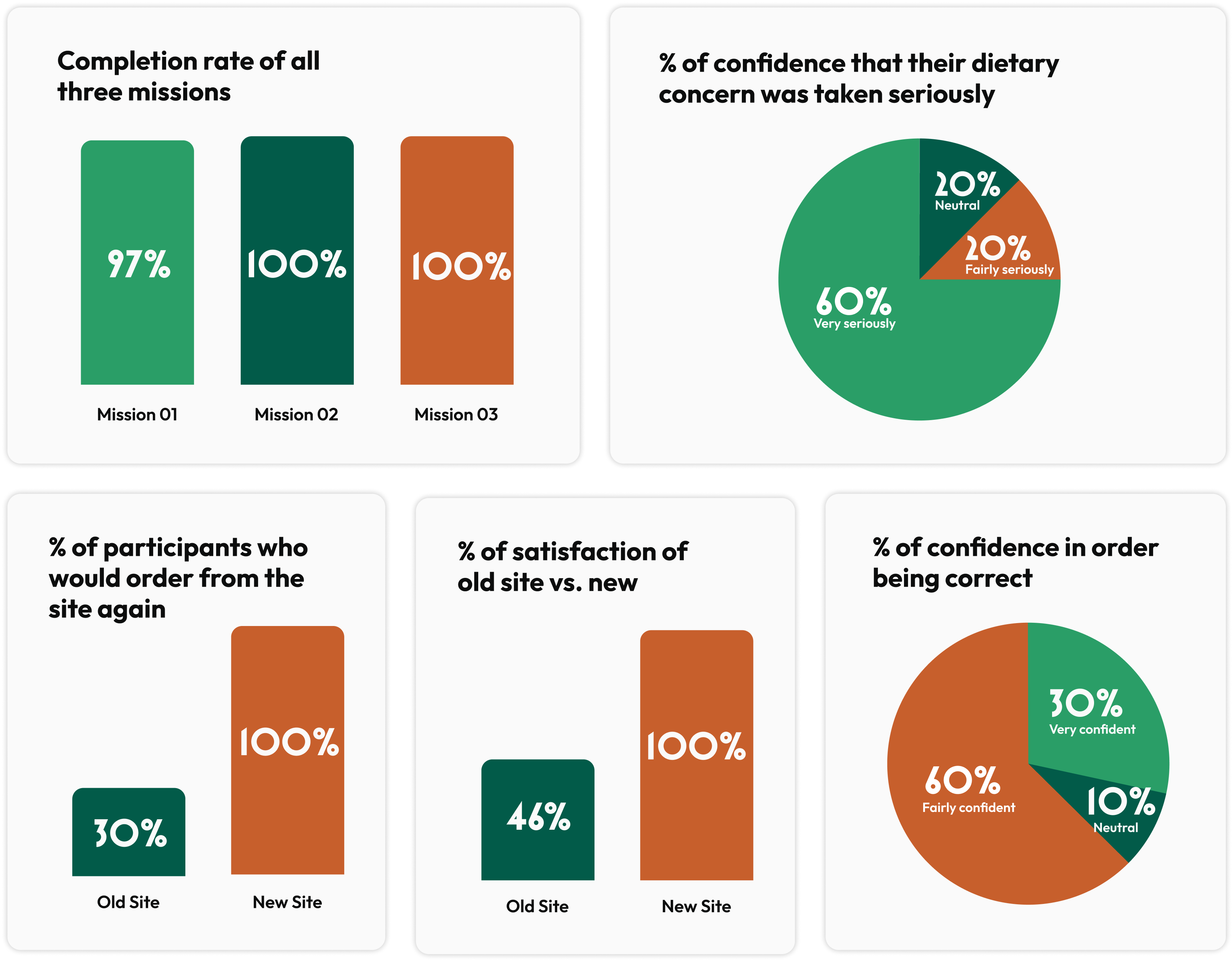
Findings & prioritizing adjustments
Overall, the participants showed a lot of excitement for the online care this site showed regarding their dietary concerns/preferences.
When viewing the old homepage, the participant used keywords like informational, text-heavy, traditional, historical, refined, and unorganized. When viewing the new homepage, many of the participants described it as earthy, fresh, community-like, healthy, and clean.
Adjusted the flow by adding a click to the pencil icon before adding a dietary preference/concern
Added a confirmation that their order was updated for their dietary preference/concern
Changed “add to cart” CTA to “add to bag” as I used a bag icon and not a cart
Although my case study has come to a close, I’ll be working with Cacao Tree to bring this product to life. On my end, here’s what the next steps will look like:
Explore the flow of a user who checks out as guest
Expand and test the development of the ingredients page
Create the team page and test whether seeing team member pictures and bios increases users trust of the site
Thank you for coming along this journey with me
While you’re here, feel free to look at some of the other cool projects I’ve been a part of!