When ordering a group Starbucks order, users aren’t able to get stars for their order nor easily communicate what they want with their desired customizations.
The solution
Create a group order feature in the current Starbucks app that allows users to upload and pay for their own drinks.
The process
Research other companies who use group order features
Conduct interviews
Create a storyboard
Build a swim lane diagram
Develop a UI kit
Create wireframes, prototype, and test
The results
Starbucks group order feature is a natural integration for current users. It enables their loyal customer base to easily order as a group all-the-while getting one of the most important things to them – stars.
Understand
Innovator of the coffee experience
With over 33,000 locations worldwide and over 8,000 in the U.S. alone, it’s no secret that Starbucks is a trailblazer for the out-of-home coffee experience. With a pretty saturated coffee shop market, I wanted to ensure Starbucks stayed ahead of the pack in this fictitious case study so they can continue being the innovator of the coffee shop experience.
Okay, but what's the goal here?
Create a group order on the Starbucks app that enables each user to order, pay, and get stars for their own drinks.
Methods I took to reach my goal
Secondary + competitive research
I analyzed data in the form of competitive analysis (those who have a group sharing feature) and quantitative metrics to better understand how users go about utilizing technology as a group.
Survey for screening
An initial survey was sent out to interested participants to see if they met the requirements of the target market before being scheduled for a 1-on-1 interview.
1-on-1 interviews
I conducted five one-on-one interviews to gain a deeper understanding of my research objectives.
Overall findings
To get an order at the same time with minimum conflict within the group
The majority of participants ordered through their own Starbucks’ app because they felt it was easier to customize, look through drinks, pay, and get rewards.
Participants don’t want to feel judged for a long order or one with many customization
Participants felt uncomfortable trying to get group members to pay them back
Participants felt like group orders were more convenient than ordering separately
Participants felt protective of their own rewards and were extremely devoted to gaining more stars.
Story time
Since there were so many different users involved in this user experience, I decided to create a storyboard. Using my participants main pain points to better explain how the group ordering Starbucks feature would work.
Taking a step back
After getting into the weeds and concluding my initial research, it was time to take a step back and look at things from a higher level. I jotted down the business, customer, and technical goals for this new feature for Starbucks.
Explore
Let's dive into a swim lane diagram
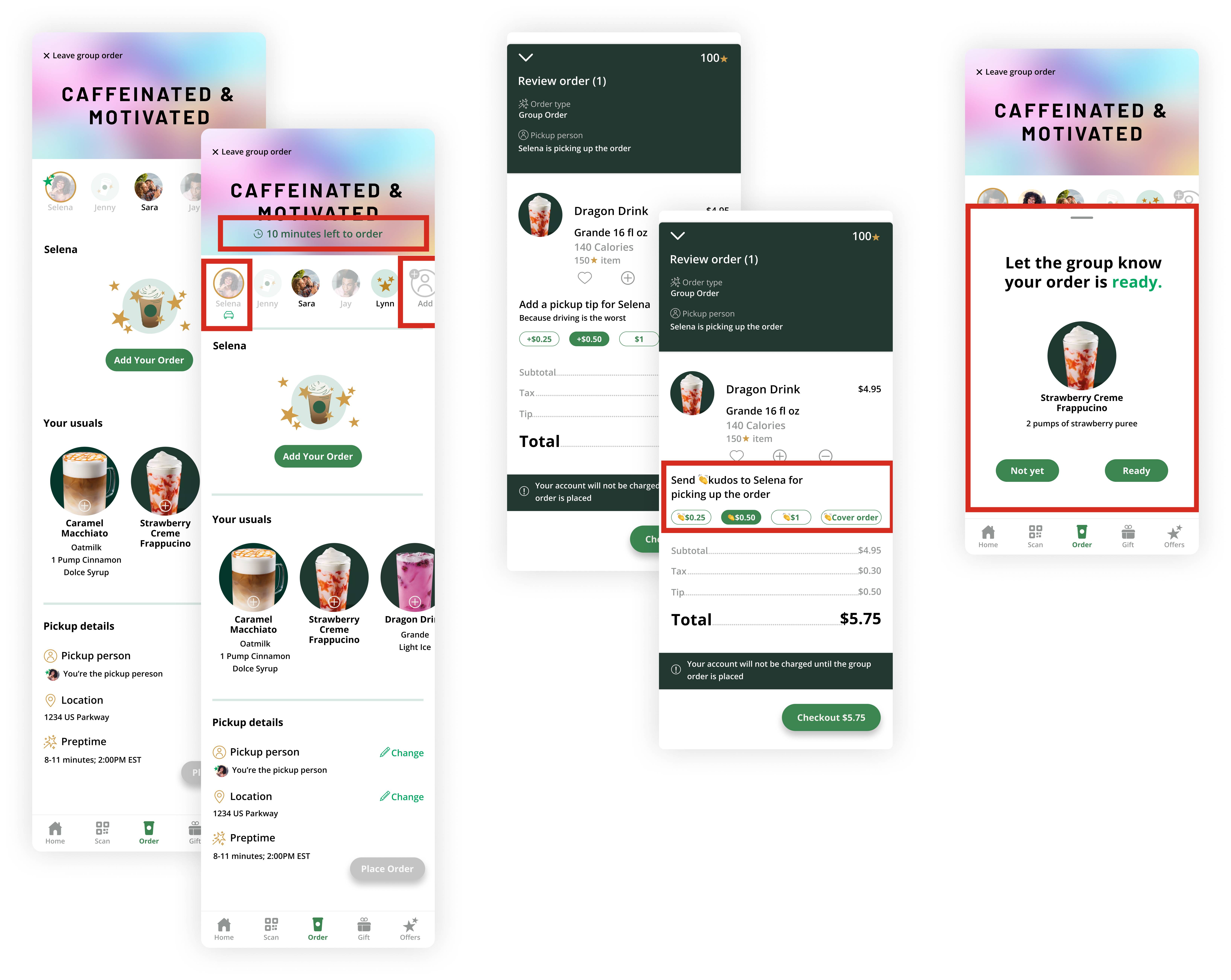
To begin the ideation process, I created a swimlane diagram to show the integration of paths of each user that would occur in one group order. The four paths were the Group Creator, the Group Participant, the Starbucks app, and Starbucks Barista. It starts with the group creator and ends with the barista handing off the drinks.
UI kit for a distinguished brand
I researched Starbucks’s colors, fonts, illustrations, etc. and decided to create a basic UI kit from there before I even attempted to sketch my low-fidelity wireframes.
I wish this was a thing, because it would help make bringing coffee to friends easier!
- usability test participant
Designing wireframes with intention
The wireframes were created with 4 different users in mind: the group creation screens, the group creator’s group page, the group participant group page, and the non app participant group page.
the group creation screens
the group creator’s group page
the group participant group page
the non app participant group page.
As I was creating these wireframes, I really had to think through the process even deeper than I ever had before to really understand the interaction users wouldn\ need for this feature to work.
This sounds like a feature that would benefit my daily life. I'm constantly picking up coworkers' orders if I'm going to Starbucks and vice-versa.
- usability test participant
Making the feature fit
Creating the UI kit beforehand really helped speed up the high-fidelity wireframe process, allowing the feature to feel like a perfect integration with the already existing app.
Materialize
UI kit for a distinguished brand
Building the prototype
With my mid-fidelity wireframes, I created an interactive prototype in figma to show and test how the user experience might feel. During this process, I discovered some potential issues that I wanted to test like
Building the prototype
I tested overall satisfaction of being a part of the group order and creating it
I tested whether a user would want to be the pickup person
I tested how easy it was to place a group order as the group creator, group participant, and non-app group participant
Affinity mapping...
Before I began making any changes to the high-fidelity wireframes and prototype, I sorted through the feedback provided to my participants to ensure I didn’t miss anything from the research and that everything was well organized to make my revisions/
...And beyond!
Once I had all the key quotes made during each test, I sorted the sticky notes based on commonalities and landed with these five groups:
Pickup person
Learnability
Usability
Tipping pickup person
Convenience
Everything felt intuitive and self-explanatory. I also enjoyed how natural this feature looks in the existing application - like it has always been there.
- usability test participant
Findings & prioritizing adjustments
From my usability test, I analyzed the data and found pain points in which I needed to adapt my prototype.
Adjusted the flow of asking to be the pickup person
Added a way to invite a member after the group has been created
Allowed users to send stars or kudos to the pickup person
Made the pickup person more visible
Added a group timer so other participants aren’t waiting around too long
Clarified what the order ready button entails or have a popup screen that makes users verify their purchase and have to click ready to continue.